 |
 |
 |
|||||
| |
|
|
|
|
|
||
|
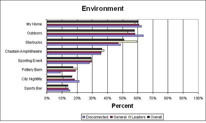
< EXAMPLES > Data display is a strength of Ministry Metrics—putting the data into a form that communicates essential truth and enables decision-making. For example, this graph combines results from surveys to three distinct subgroups of singles. In one question, each person could choose only three of eight options to complete the question, “My favorite environment feels like….” The graph shows that most people’s preferred environment feels like home, and that it didn’t matter which group they were from.
|
 |
|
|
| © 2004 MinistryMetrics. All rights reserved |
|
|
|
|
||
